Find Your Car

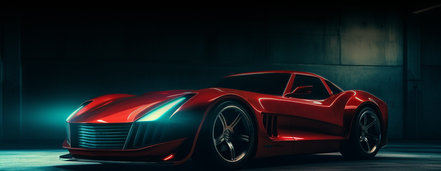
Find Your Perfect Car
Get StartedTop Cars
Search for your favorite car
 All Types
 All Ex-Showroom Price
 All Brands
 Search
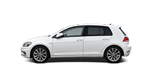
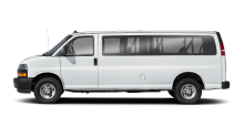
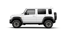
Popular Cars
New Release Rank
Browse by Brands
View More


Find Your Perfect Car & Discover Your Ideal Vehicle
Discover the ideal car for you with our comprehensive car selection tool. Explore options tailored to your needs and preferences.

Categorized Viewing
Browse by brand, model, and price.

Multidimensional Analysis
Detailed insights on performance and safety.

Comprehensive Ratings
Expert and user-based scores.

Latest Vehicle Info
Up-to-date market releases.